
Why is visual design important?
What is visual design?
According to the definition of Usability.gov, visual design is the strategic implementation of images, colors, fonts and other elements, in order to enhance a design or interaction and engage users.
Visual design is different from interaction design. Interaction design focuses on the functionality needed to perform a task. Visual design engages users by drawing attention to proper functionality, prioritizing activities on a page through size, color, and use of white space.
Visual design is therefore much more than making an interface “nice”; we can rather consider it a bridge between graphic design and user experience. In a nutshell, visual design integrates static layouts and interactive elements in order to increase the ease of use of a product / service.
Fundamental principles for a good visual design
A good visual helps to perceive the design as a harmonious whole, made up of immediately identifiable elements rather than a dispersive chaos of individual parts. In this sense, the first golden rule is to remove everything that is not needed (less is more, trivial but true).
After pruning, it is essential to establish:
– what kind of content will take place in the interface
– what is the hierarchical relationship between contents (in this regard, take a look at the Communicating with visual hierarchy presentation by Luke Wroblewski, Google Product Director)
– how to make this hierarchical relationship visually immediate
The good organization, and consequently the communicative effectiveness, of an interface will depend on this preliminary planning stage.
That said, there are some general principles to follow to set up a good layout. Let’s see them together:
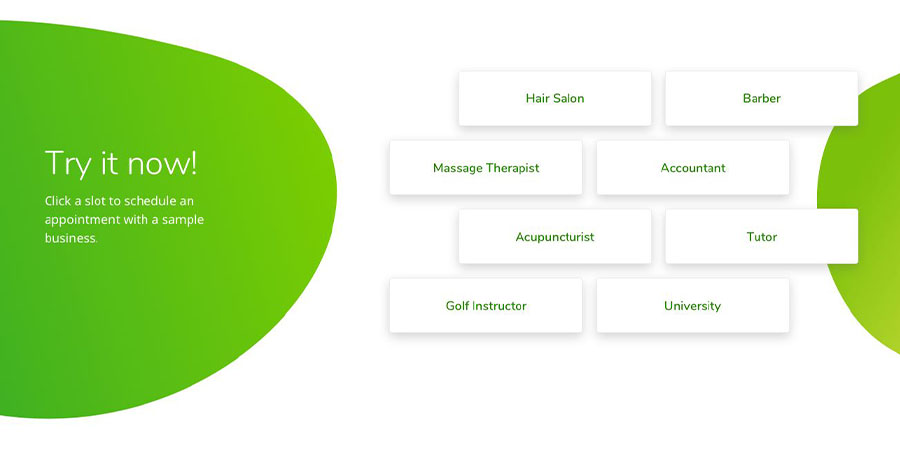
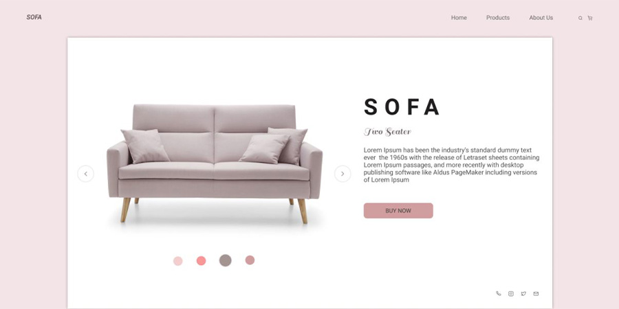
Unit: elements on a page visually or conceptually belonging to the same group by proximity, similar characteristics, etc.
Source: Behance.net – Designer: Maia Shanina
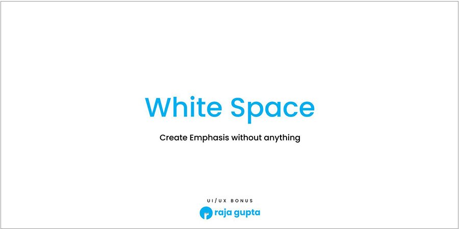
Space: the void that contains and/or is interposed between the elements. The so-called negative space or white space is vital to reduce visual noise, improve readability and giving the layout breath.
Source: Behance.net – Designer: Raja Kumar Gupta
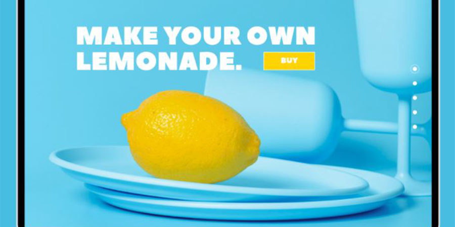
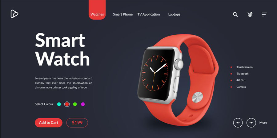
Contrast: it highlights some elements emphasizing the difference in terms of size, color, direction, position in space. It has a highly strategic value, because it guides the eye where it is considered important.
Source: Behance.net – Designer: Lisa Logvinova
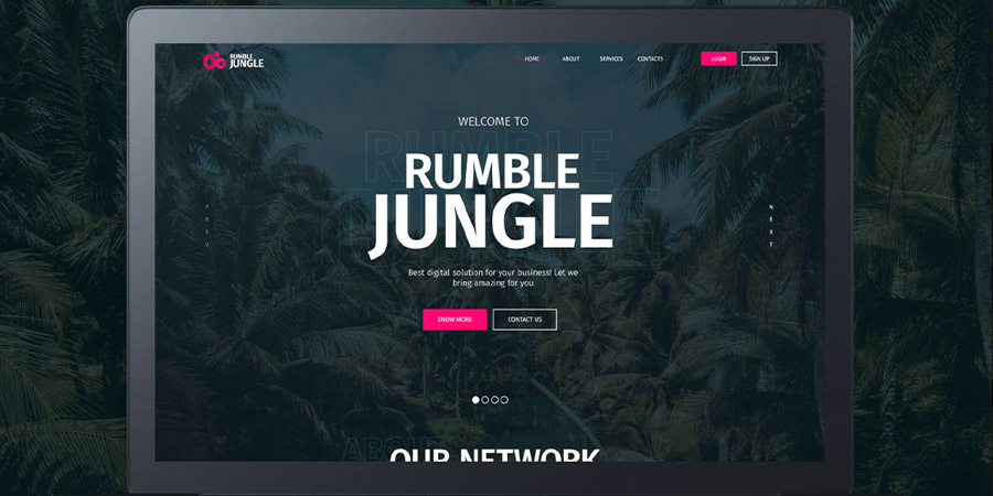
Hierarchy: makes the difference in value between elements of the layout immediately visible. It uses the contrast through different sizes and/or families of fonts, colors and positions within the layout.
Source: Behance.net -Designer: Timur Kozub
Balance: it creates the perception that there is a balanced distribution of elements in space (it does not necessarily imply that there is symmetry).
Source: Behance.net – Designer: Aksanna Kobelyan
Dominance: concentrates the focal point in a certain element, with respect to which all the others are subordinate. To do this it can resort to differences in size, color, position, shape.
Source: Behance.net – Designer: Double Vision, Keya Akter, Yasin Arafat.
Similarity: gives coherence and continuity to a design project, making the structure and usability of one or more interfaces easier to understand.
Source: Behance.net – Designer: Sophie Kozachek
Rhythm: the visual rhythm uses the principle of repetition of graphic and/or structural elements according to a precise pattern in order to return a feeling of immediate familiarity with the interface.
Source: Behance.net – Designer: Ismail Hossain
So, why is visual design important?
Does good or bad visual design affect usability and the user experience?
Yes, indeed.
In Don Norman’s book, Emotional Design: Why we Love (or Hate) Everyday Things, Norman reports a study showing how the degree of aesthetics of a system affects post-use perceptions of both aesthetics and usability, while the degree of actual usability would not have the same effect. In other words, visual design has as much effect on the overall experience as does actual usability. Taking care of it can really make a difference on the customer experience of your product or service. The categorical imperative is: understanding when, how, where and under what conditions a potential customer uses the product and do everything in your power to simplify the task. And finally test and make any necessary adjustments.
Putting yourself in the other’s shoes is an exercise of inestimable value, even on a professional level. And, in the long run, it pays off.